the hive
Branding, visual identity, 2025
A hexagon mark whose letter h forms a doorway, for a coworking space.
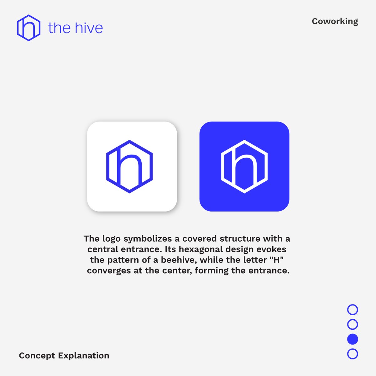
A visual identity for the hive, a coworking space — a hexagonal mark where the letter "h" converges at the centre to form an entrance, paired with Aktiv Grotesk and a single, confident blue.
The hive needed a mark that could work as small as a favicon and as large as a sign above the door — a single hexagonal cell with an "h" built into its frame, doubling as a doorway.
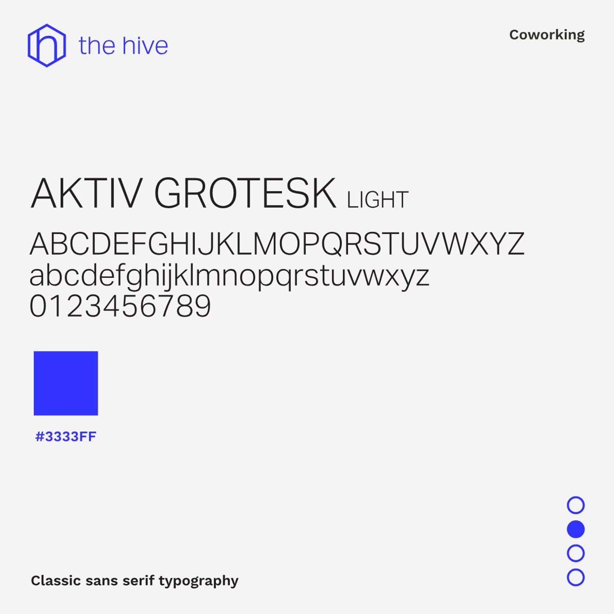
Aktiv Grotesk and one saturated blue keep the system calm and consistent across every touchpoint.
- Client
- the hive, coworking space
- Discipline
- Branding, visual identity
- Year
- 2025
- Typeface
- Aktiv Grotesk